My Design Philosophy
Good design doesn't shout — it guides. Whether I'm laying out a brand identity or illustrating a children's book, the same principles that have shaped art for centuries are doing the quiet work behind every decision I make.
The Principles — With Your Voice:
Balance
Visual weight matters. A layout that feels "off" usually is — something is competing for attention that shouldn't be. I treat every composition the way I approach a portrait: nothing gets placed without intention.
White Space
Empty space isn't wasted space — it's breathing room. It's what allows the important elements to land. I've learned from drawing that what you leave out is just as powerful as what you put in.
Unity
Every element on a page should feel like it belongs to the same family — color, type, shape, and imagery working as one. When unity breaks down, trust breaks down with it.
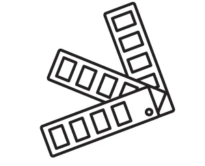
Contrast
Contrast creates hierarchy. It tells the viewer where to look first, second, and third. Without it, everything competes and nothing wins.
Alignment
Nothing is placed arbitrarily. Alignment creates order, and order creates professionalism — even when the design feels loose and creative on the surface.
Repetition
Consistency builds recognition. Repeating visual elements across a brand or a layout is what makes design feel intentional rather than assembled.
These aren't rules I follow — they're tools I reach for. The goal is always the same: design that works as hard as it looks good.