Case Study:
HaWa Harmony Wave
A consumer-electronics brand designed from the ground up — identity, packaging, and a full digital ecosystem — for the traveler who needs the world to disappear for a few hours.
ROLE
Lead Designer —identity, packaging & UX
DELIVERABLES
Logo, 3-panel packaging, e-commerce & app
TOOLS
Illustrator, Photoshop, Figma, Pacdora
TYPE
Concept brand · Full system

The Challenge
Every great brand starts with a person. For HaWa, that person is Mike — a sales rep who lives in airports, back-to-back calls, and long travel days.
His headphones aren't a luxury — they're a work tool, and the ones he's been using keep letting him down. The brief: build a headphone brand light enough to forget you're wearing it, smart enough to keep up with his day, and confident enough to stand on a retail shelf beside established players.

The Name
HaWa isn't just a product name — it's a layered brand story.
Arabic · Hindi · Urdu: Hawa — air, wind, breeze. A nod to the ultra-light 60g frame.
Swahili: Hawa — love and desire. The bond between a listener and their music.
Hawaii: Home of the brand — open, warm, and unhurried.
Three meanings. One name. A brand built to travel.

HaWa was designed for Mike. But it was built for anyone who's ever put on headphones and needed the world to disappear for a few hours.
Light as air. Deep as love.

The Strategy
Before a single color was chosen, the customer was defined.
Persona: Mike K. · Age 30 · Sales Rep · Frequent Flyer
Mike's three pain points shaped every design decision:
Short battery life on long hauls → 30hr playback + LED battery indicator
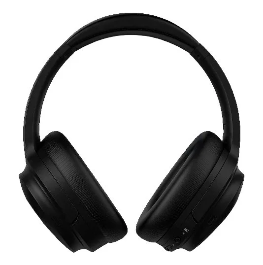
Heavy headphones causing ear fatigue → ~60g ultra-light frame with premium cushioning
Poor sound quality and weak noise canceling → 40mm dynamic driver + active noise canceling
Every feature callout, every line of copy, and every packaging panel was written and designed to answer Mike's needs directly.
The Brand Strategy
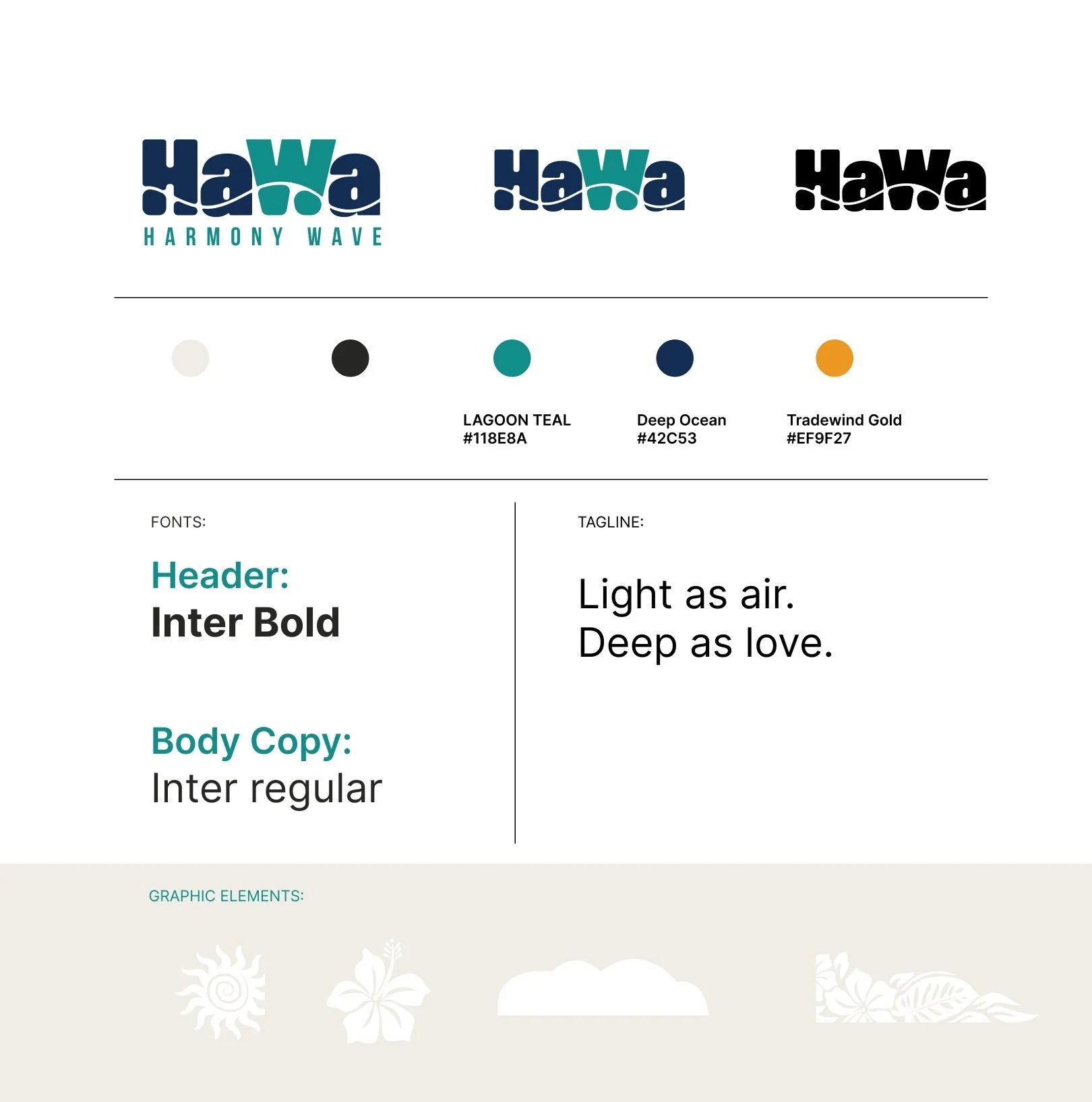
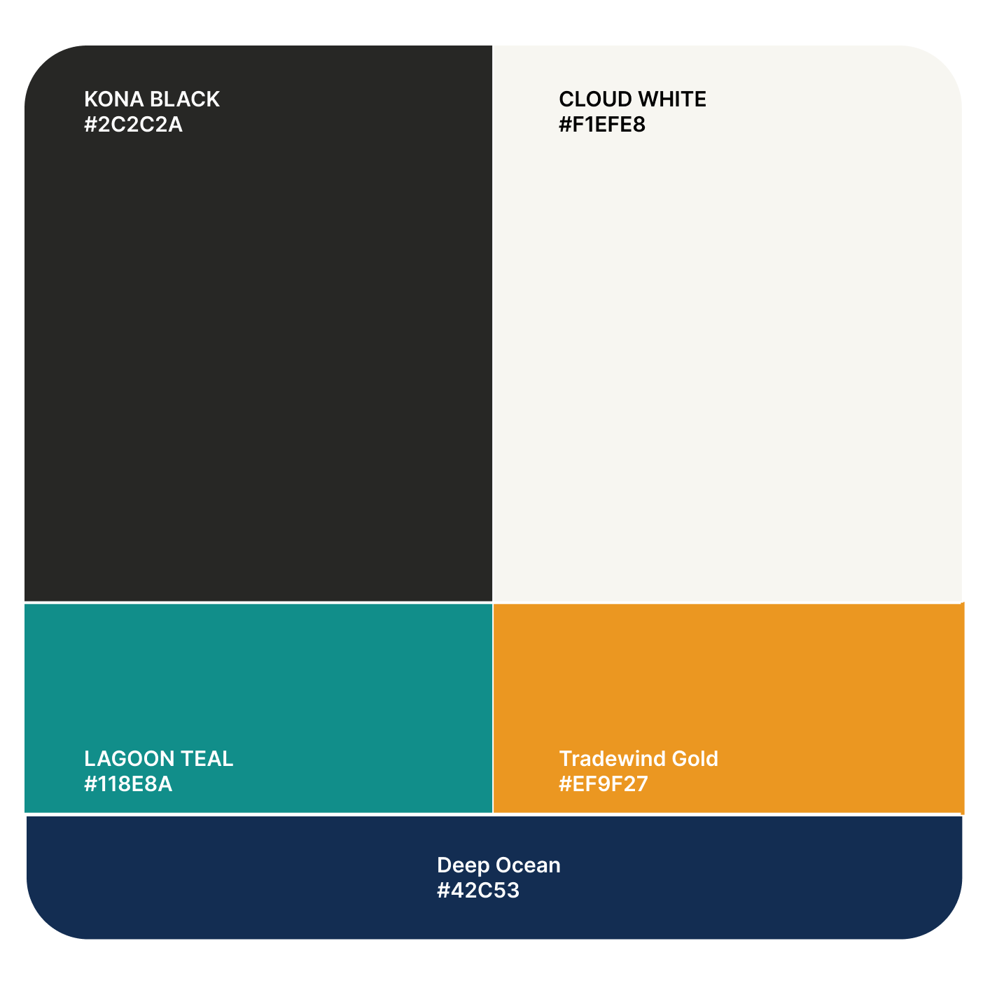
The visual identity draws from three sources: the Hawaiian landscape, the physics of air and light, and the warmth of the Swahili meaning.
Color palette:
Deep Ocean #042C53 · Reef Teal #0F6E56 · Tradewind Gold #EF9F27 · Kona Black #2C2C2A · Cloud White #F1EFE8
Typography: DM Sans for headlines and UI. Inter for body and spec copy.
Brand tagline:Light as air. Deep as love.
The tagline works on every level — product weight, sound immersion, and the emotional meaning behind the name.
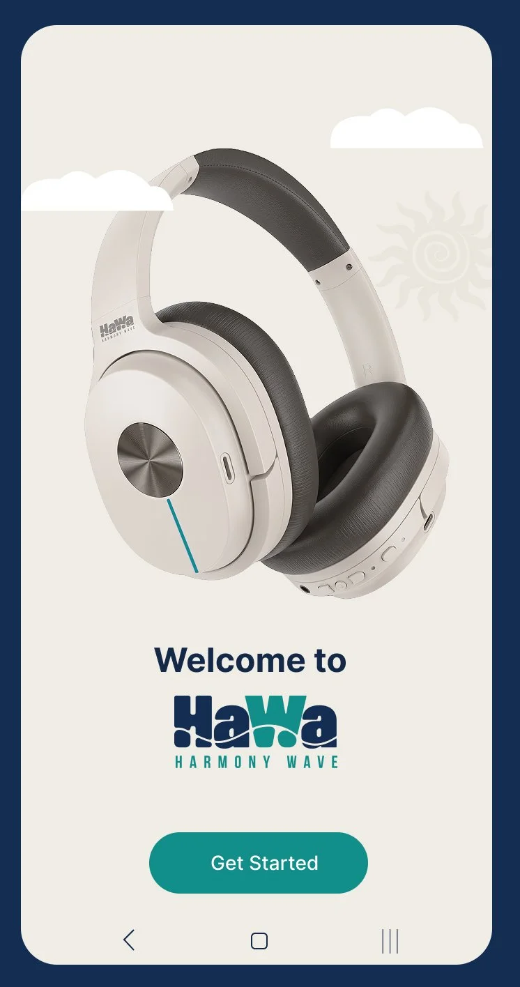
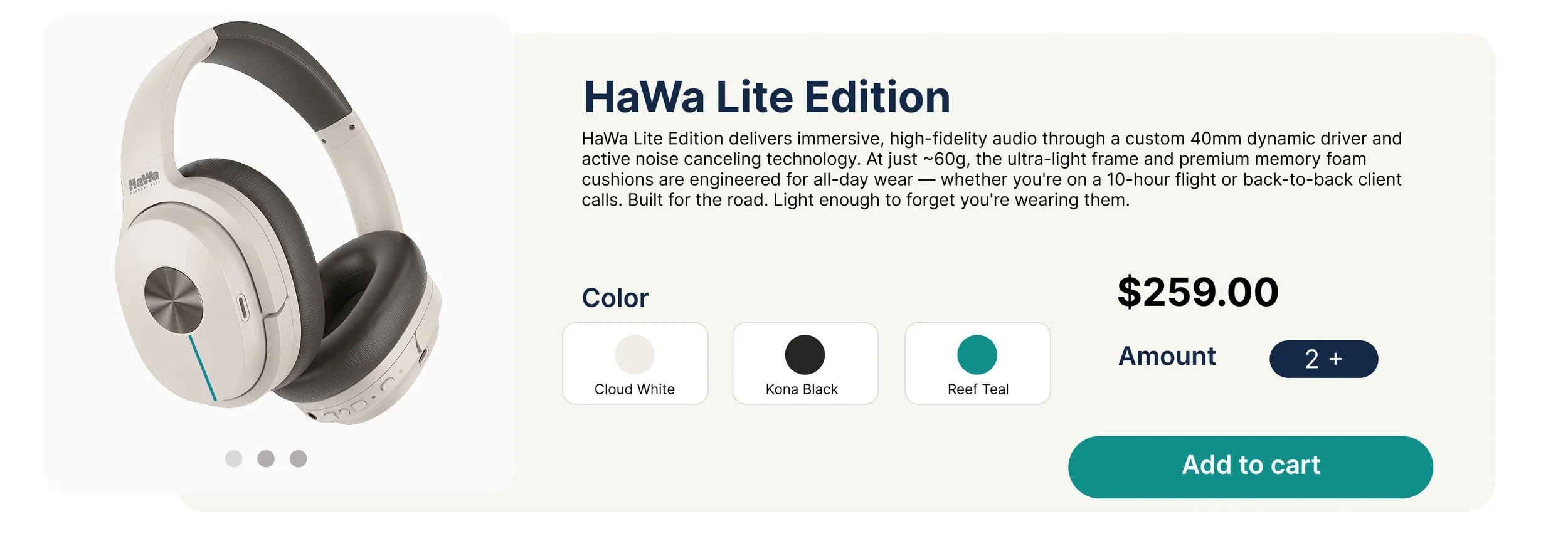
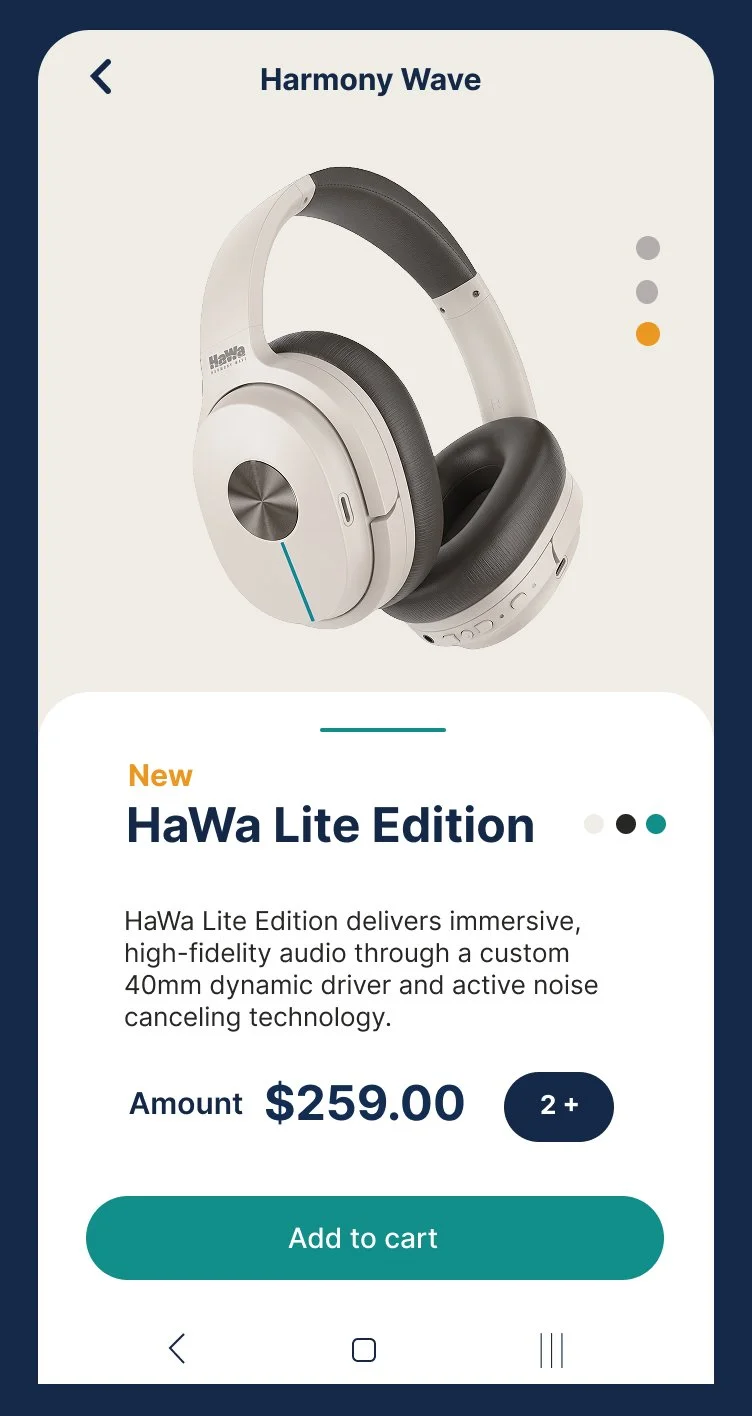
HaWa Digital Ecosystem
E-commerce · Mobile App · UX Design · Figma
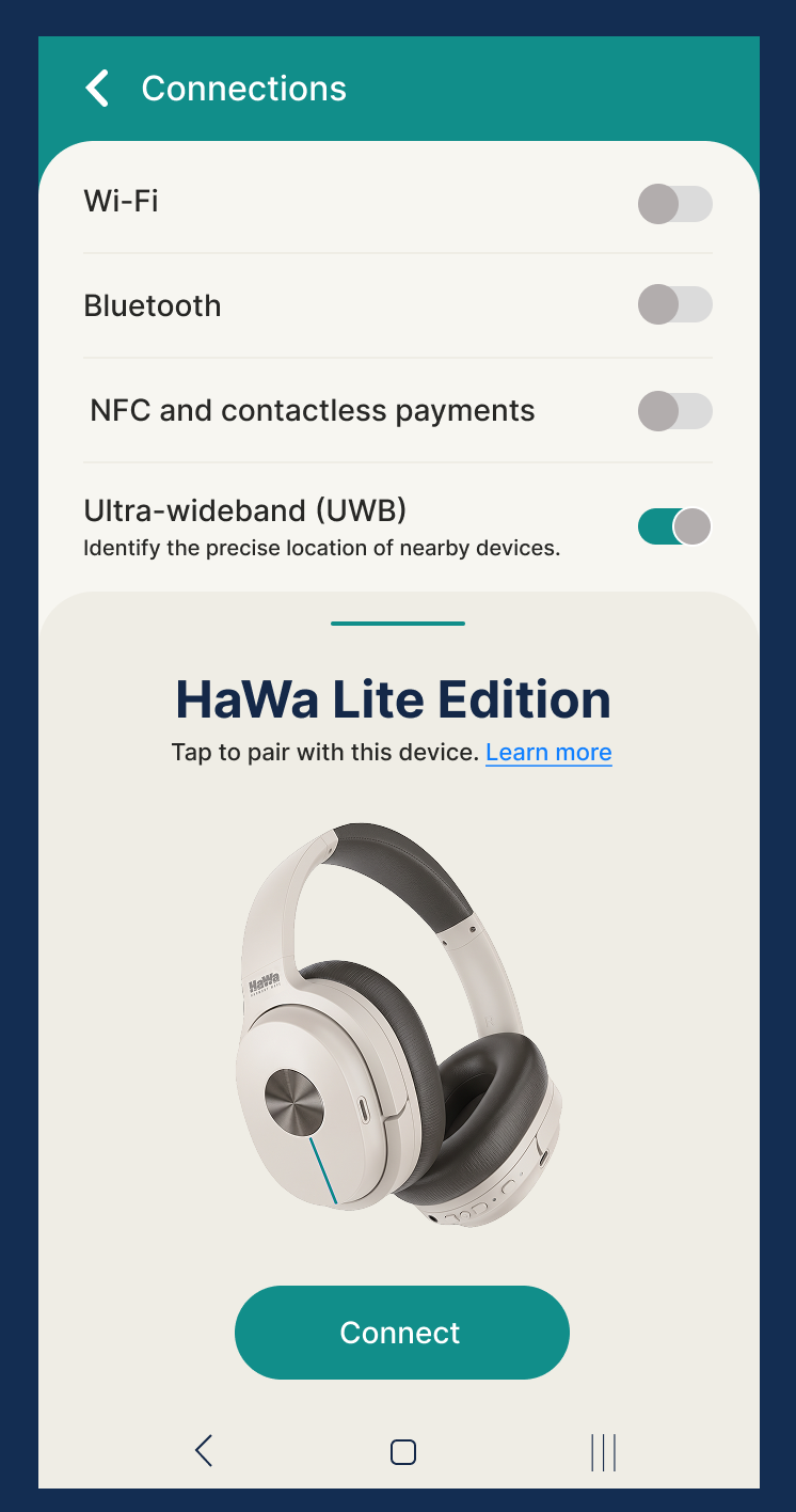
Designed the full digital touchpoint system for HaWa Lite Edition — from first product discovery to device pairing.
The Packaging
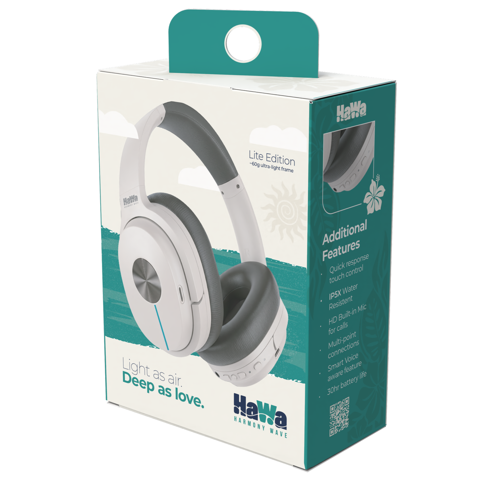
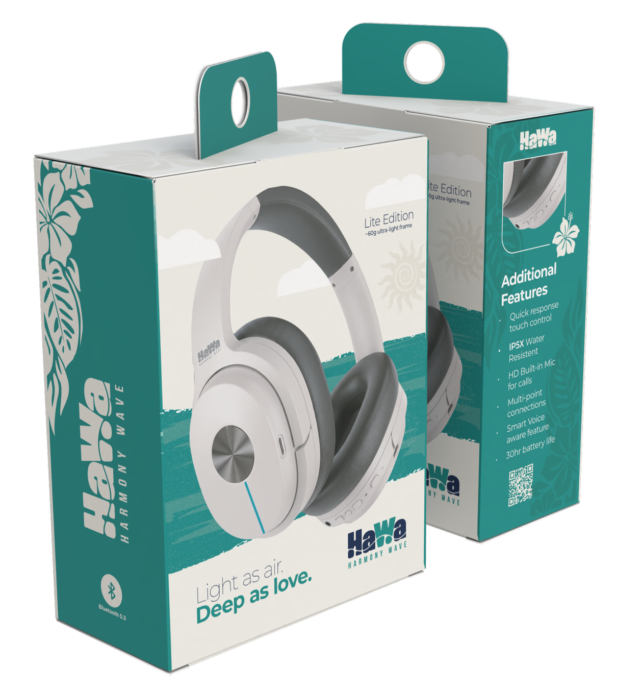
The retail packaging system was designed to function across three panels, each with a distinct job.
The front face leads with the product and the emotional tagline — designed to stop a shopper mid-aisle. A sky-and-ocean horizon illustration places the headphones in the HaWa world, not just on a shelf.
The side panel carries the Hawaiian botanical pattern — monstera leaves and hibiscus — alongside the vertical HaWa Harmony Wave wordmark. It tells the brand's origin story without a single word of copy.
The back panel speaks to the informed buyer — HD built-in mic, 30hr battery, IP5X water resistance, multi-point connections, Bluetooth 5.3, and smart voice awareness. A QR code links to the full product experience at hawaharmonywave.com.
Adobe Illustrator · Adobe Photoshop · Canva · Meshy.ai · Pacdora
The Work
· Logo & wordmark
· Retail box packaging — full three-panel system
· 3D packaging mockups
· Digital ecommerce banner
· Brand color system
· Customer persona
· Hang tag concept (front & back)
· Brand tagline & copy